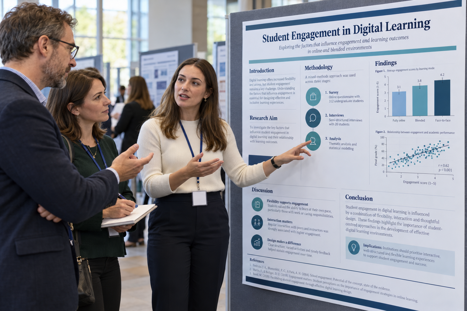
Academic poster presentations require students to communicate complex research in a format that must work both visually and academically. Unlike an essay or dissertation chapter, a poster may receive only a few seconds of initial attention before a reader decides whether to stop and examine it. At the same time, university examiners may assess research quality, critical thinking, methodological understanding, referencing, visual communication, and the student's ability to explain the work orally.
An effective academic poster therefore cannot simply be a research paper enlarged onto an A1 or A0 page. It must reduce a larger project to its intellectual essentials, establish an obvious reading sequence, make important findings visually accessible, and leave enough space for the reader to process the information. The oral presentation, when required, should then extend the poster rather than read its text aloud.
This academic poster presentation guide explains how to decide what information belongs on a poster, organise research logically, use text and visuals effectively, prepare for examiner questions, and avoid common design mistakes. The central principle is straightforward: a strong poster makes the research question, evidence, principal finding, and significance understandable quickly without sacrificing academic credibility.
What Is an Academic Poster Presentation?
An academic poster is a visual form of scholarly communication used to present research, analysis, projects, or evidence-based arguments. Posters appear in undergraduate and postgraduate assessment, research conferences, dissertation showcases, laboratory projects, healthcare education, engineering exhibitions, and other forms of academic dissemination. Their purpose is usually to communicate the central message of a project efficiently while giving an audience an opportunity to inspect the evidence and discuss it with the presenter.
The University of Leeds guidance on effective poster presentations emphasises audience, purpose, visual impact, a clear message, useful images or diagrams, and an obvious reading order. These priorities show why poster design is not merely decoration. Visual organisation determines whether readers can understand the research quickly enough to engage with it.
A poster presentation may also involve a short oral explanation or question-and-answer session. In that case, the poster becomes a visual support for scholarly discussion. Students should be able to explain why the research matters, defend methodological choices, interpret the main findings, acknowledge limitations, and identify the project's contribution without reading directly from the display.
An academic poster is not a compressed essay. It is a visual argument that allows a reader to understand the purpose, evidence, findings, and significance of a project efficiently.
Start with the Assessment Brief Before Designing the Poster
Poster conventions vary significantly between modules and disciplines. One university may require an A1 portrait poster with a fixed template, while another permits landscape orientation, digital submission, embedded QR codes, or a specific word limit. Some assessments grade only the poster, whereas others combine poster quality with a live presentation or examiner questioning.
The University of Leeds poster assessment guidance explicitly advises students to begin with module instructions because marking criteria differ between departments. Typical criteria may include knowledge and understanding, critical analysis, sources and referencing, methodology, content and argument, visual structure, and presentation skills.
Before drafting content, identify the non-negotiable requirements. These may include dimensions, orientation, required headings, reference style, logo use, institutional affiliation, maximum word count, presentation duration, file type, or accessibility expectations. A beautifully designed poster can still lose marks if it ignores the assignment specification.
What Structure Should an Academic Research Poster Use?
The poster structure should reflect the logic of the project rather than mechanically reproduce every section of a dissertation. Empirical research posters often follow a shortened research-paper sequence: background or problem, research question, methods, results, interpretation, and key conclusion. The exact headings can be adapted so that they communicate meaning rather than merely reproduce generic labels.
Epic Essay's research paper structure and format guide explains how research normally progresses from the problem and existing knowledge through methodology to findings and interpretation. A poster retains this intellectual progression but compresses it dramatically and relies more heavily on figures, tables, diagrams, and concise statements.
A practical poster may contain the following components:
- A concise research title and author information.
- A brief statement of the problem or research context.
- The research question, aim, or hypothesis.
- A highly condensed methodology section.
- The most important findings, preferably supported visually.
- A short interpretation of what the findings mean.
- A clear conclusion or key takeaway.
- Essential references, acknowledgements, and contact information where required.
Not every project needs every item as a separate box. For example, a literature-based poster may replace methodology and statistical results with a search strategy, thematic synthesis, conceptual comparison, or evidence map. The correct structure is the one that makes the project's argument visible to the intended audience.
| Poster Element | Main Purpose | What to Prioritise |
|---|---|---|
| Title | Communicate the topic immediately | Clarity, specificity, and relevance |
| Background | Establish why the research matters | Problem, gap, and essential context |
| Research question or aim | Define what the project investigates | One clear and visible statement |
| Methods | Show how evidence was generated | Design, sample, data, and analysis |
| Findings | Present the strongest evidence | Key results, charts, patterns, or themes |
| Interpretation | Explain what the findings mean | Significance, comparison, and critical insight |
| Takeaway | Leave the audience with the central message | One defensible conclusion or implication |
The table highlights an important design principle: every section should perform a clear intellectual function. If a block of text does not help the reader understand the question, evidence, or significance, it may not deserve scarce poster space.
How Much Background Should an Academic Poster Include?
Background is necessary because readers need to understand why the project exists, but it is also one of the easiest areas to overload. Students sometimes reproduce several literature-review paragraphs, leaving too little space for their own findings. A poster should instead identify the problem, relevant gap, and the minimum theoretical context necessary to interpret the research.
A useful test is whether the audience can answer three questions after reading the opening area: What problem is being addressed? Why does it matter? What specific question does this project answer? If those points are clear, additional literature summary may be unnecessary.
References can demonstrate scholarly grounding without reproducing the full literature review. Select only sources that are central to the rationale, methodology, or interpretation. The poster should foreground the current project rather than allow previous scholarship to dominate the page.
How to Present Methodology Without Overloading the Poster
The methodology section should give enough information for readers to understand how the evidence was produced and assess whether the approach was appropriate. For quantitative work, this may include research design, sample size, important participant characteristics, variables, instruments, and statistical analysis. Qualitative projects may identify participants, recruitment, data collection, analytical method, and key ethical procedures.
A workflow diagram can sometimes communicate methodology more efficiently than a paragraph. For example, a systematic review poster might show database searching, screening, eligibility, and final inclusion as a sequence. An experiment might show recruitment, group allocation, intervention, measurement, and analysis in a compact visual process.
Methodological concision should not conceal weaknesses. If a limitation is important for interpreting the result, acknowledging it can demonstrate stronger critical understanding than presenting the design as flawless. Examiners often use methodology questions to determine whether students understand why the chosen approach was appropriate and what its boundaries are.
Make the Findings the Visual Centre of the Poster
For research posters, findings are often the most important content because they represent what the project actually contributes. A common design error is giving large areas to background and methodology while squeezing the main results into a small corner. The visual hierarchy should normally make the central findings easy to locate.
Charts, graphs, diagrams, thematic maps, conceptual models, and carefully designed tables can communicate evidence more efficiently than dense prose. The appropriate visual depends on the data. A bar chart may communicate group differences clearly, a scatterplot may show an association, and a thematic diagram may show relationships among qualitative categories.
Visuals still require interpretation. Readers should not have to guess what a graph proves or search through a complex figure for the important pattern. Give each visual a descriptive title or caption and accompany it with a concise statement identifying the main takeaway.
The reader should be able to identify your most important finding without reading every sentence on the poster.
How to Design a Clear Reading Order
A strong poster guides the eye deliberately. Readers should know where to begin, where to move next, and where the final conclusion appears. The University of Leeds guidance on poster design recommends using structure and grid-based layout to influence reading order while retaining sufficient empty space.
A multi-column layout often works well because it allows readers to progress naturally across the page. However, the number of columns matters less than consistency. Misaligned boxes, irregular gaps, competing headings, and unclear transitions increase visual effort and make strong research harder to follow.
White space is not wasted space. It separates sections, reduces visual crowding, and helps important content stand out. Students sometimes fill every available area because they equate empty space with missing content, but excessive density usually makes a poster less readable and less professional.
Font Size, Colour, and Visual Hierarchy
Poster text must be readable from farther away than ordinary written assignments. The University of Warwick poster guidance recommends large title and heading fonts and suggests approximately 24–36 points for body text in its poster context. These are useful orientation values, but students should follow the specifications of their own institution and poster size.
Visual hierarchy should make the title largest, section headings clearly secondary, and body text consistent. Too many font families, sizes, or decorative effects create competition rather than hierarchy. Epic Essay's academic formatting rules guide similarly emphasises consistency and readability as central features of professional academic presentation.
Colour should help organise information rather than decorate every element. Use sufficient contrast between text and background, limit the palette, and avoid colour combinations that make text difficult to read. Important distinctions should also be communicated through labels, patterns, or wording rather than colour alone so that the poster remains accessible.
| Design Choice | Effective Approach | Common Problem |
|---|---|---|
| Typography | Consistent, readable fonts with clear hierarchy | Small body text and too many font styles |
| Colour | Limited palette with strong contrast | Bright competing colours or low contrast |
| Spacing | Visible margins and white space between sections | Every area filled with text or graphics |
| Alignment | Consistent grid and aligned content blocks | Random boxes with no obvious reading sequence |
| Visuals | Relevant charts, diagrams, and high-quality images | Decorative images unrelated to the evidence |
| Text | Concise statements and selective detail | Essay paragraphs copied directly onto the poster |
Good poster design is therefore functional. Every visual decision should make the academic message easier to find, understand, or remember.
How Much Text Should an Academic Poster Have?
There is no universal word count because poster size, discipline, assessment format, and audience differ. Warwick provides an example range of roughly 300–800 words in its poster guidance, but this should not be treated as a universal requirement. A module specification may require considerably more or less.
The more useful principle is that the poster should not require sustained essay-style reading. The Leeds poster-planning guidance warns against turning a poster into a multi-page document placed on a large sheet. Readers should be able to move quickly between sections, identify the key message, and then choose which areas deserve closer attention.
Conciseness does not mean replacing every paragraph with fragments. Short explanatory paragraphs can still be useful where reasoning is necessary. The goal is to remove repetition, unnecessary background, procedural detail, and wording that the presenter can explain orally.
How to Use Tables, Charts, and Images Academically
Visuals should earn their place by communicating information more efficiently than prose. A graph showing the difference between three experimental groups is likely more useful than several sentences listing means. A conceptual diagram may explain a theoretical relationship more clearly than a dense block of definitions.
Every figure should be interpretable. Axes need labels, legends must be understandable, categories should be defined, and numerical scales should not distort the apparent result. A graph that looks attractive but exaggerates differences or omits important information can weaken the academic credibility of the poster.
Images must also be relevant and legally usable. Decorative stock imagery rarely strengthens an academic argument unless the image has a clear communicative function. Where external images, figures, or data are used, credit them according to the required referencing convention.
What Do Examiners Look For in an Academic Poster?
Examiner expectations vary by marking rubric, but visual attractiveness is rarely the only criterion. Leeds identifies areas including content and argument, methodology, poster design, criticality, sources, and presentation skills. This means a polished layout cannot compensate for a vague research question or unsupported conclusion.
Examiners are likely to look for coherence between the different parts of the research. The research question should correspond with the methodology, the results should answer the question, and the conclusion should follow from the evidence. Strong posters make this chain immediately visible.
Criticality is another important distinction. A descriptive poster reports what was done; a stronger academic poster demonstrates judgement. It may identify a limitation, explain why one interpretation is more persuasive than another, distinguish statistical significance from practical importance, or show how the findings challenge existing expectations.
| Assessment Area | What Strong Work Demonstrates |
|---|---|
| Research focus | A clear problem, question, aim, or hypothesis |
| Academic knowledge | Accurate understanding of relevant concepts and literature |
| Methodology | An appropriate approach that the student can justify |
| Evidence | Relevant results presented accurately and selectively |
| Critical analysis | Interpretation, limitations, implications, and reasoned judgement |
| Visual communication | Readable hierarchy, logical flow, appropriate visuals, and effective spacing |
| Referencing | Credible sources acknowledged consistently |
| Oral presentation | Clear explanation and confident responses to questions where assessed |
The strongest preparation strategy is therefore to design from the marking rubric backwards. If critical analysis carries substantial marks, it needs visible poster space rather than being saved entirely for the oral explanation.
How to Reference Sources on an Academic Poster
Poster referencing follows the same principle as other academic work: borrowed ideas, data, images, theories, and quotations must be acknowledged. However, limited space means the presentation of references may be more compact. Some assignments require a conventional reference list, while others permit shortened references or a QR code leading to supplementary material.
Do not shrink references to an unreadable size simply to include every source consulted during the project. Select the sources actually cited on the poster and follow the format required by the module. If instructions specify APA, Harvard, Vancouver, or another system, use that style consistently.
Because requirements differ substantially, referencing decisions should come from the assessment brief rather than from a universal poster template. The same principle applies to institutional logos, acknowledgements, ethics statements, and QR codes.
How to Prepare the Oral Poster Presentation
If the assessment includes a live explanation, prepare a short verbal route through the poster. The oral presentation should communicate the research problem, what you did, what you found, and why the finding matters. It should not reproduce every block of poster text.
Epic Essay's thesis defense presentation guide highlights a closely related principle: students should communicate the core contribution of their research and be able to justify methodology, findings, limitations, and implications. Poster questioning often assesses the same depth of ownership on a smaller scale.
A useful short presentation can follow four questions:
- What problem or research question did the project address?
- How did you investigate it?
- What is the most important finding?
- Why does that finding matter?
Practise answering those questions at different lengths. You may need a thirty-second summary for a passing viewer, a two-minute explanation for an examiner, and a longer response when someone wants methodological detail.
Prepare for Examiner Questions, Not Just the Presentation
Questions often reveal whether the student understands the research beyond what appears on the poster. An examiner may ask why a particular method was chosen, whether another interpretation is possible, how a limitation affects the conclusion, or what would be changed if the study were repeated.
Students should therefore know the details that were intentionally omitted from the poster. A concise methods box may not include every sampling decision, but the presenter should still be able to explain those decisions. Similarly, a chart may display only the central finding, while the student should understand its assumptions, uncertainty, and limitations.
Never rely on the poster to answer questions for you. The poster demonstrates your ability to select and communicate evidence; the discussion demonstrates your understanding of the research behind it.
Common Academic Poster Mistakes to Avoid
The most common problem is excessive text. Students often begin with a written assignment and paste shortened paragraphs into boxes until the poster is full. This produces a document that technically contains the research but fails to communicate it visually.
A second problem is weak prioritisation. Background material occupies half the poster while the findings receive one small chart. The amount of space given to each section should reflect its importance to the central message, not the amount of material available in the dissertation.
Design inconsistency also weakens professional presentation. Random colours, multiple fonts, uneven headings, stretched images, unclear graph labels, and misaligned sections distract the audience from the research. Professional visual restraint is normally more effective than adding decorative elements to every available area.
Finally, students sometimes present conclusions that go beyond their evidence. A small observational study cannot normally establish causation simply because the poster needs a strong final message. Concision should sharpen the argument, not remove methodological caution.
A Step-by-Step Academic Poster Preparation Checklist
Poster preparation is easier when content selection occurs before visual design. Starting immediately with colours and templates can result in an attractive page whose research logic remains unclear. The following sequence keeps academic purpose at the centre of the process.
- Read the assessment brief and marking rubric carefully.
- Confirm poster dimensions, orientation, submission format, and presentation requirements.
- Identify the exact audience for the poster.
- Write one sentence stating the main message you want the audience to remember.
- Select only the background information needed to understand that message.
- Make the research question, objective, or hypothesis clearly visible.
- Compress the methodology to its decision-relevant elements.
- Select the strongest findings rather than every result collected.
- Choose charts, diagrams, tables, or images that genuinely improve understanding.
- Write a concise interpretation and evidence-based takeaway.
- Arrange sections in an obvious visual reading order.
- Use consistent typography, alignment, colour, and spacing.
- Check that references and source credits follow the required style.
- View the poster at reduced scale and from a realistic reading distance.
- Proofread numbers, labels, headings, citations, and figure captions.
- Prepare a short oral explanation of the research.
- Practise answering questions about methodology, limitations, and implications.
- Compare the final poster directly against every item in the marking rubric.
This workflow treats design as part of research communication rather than an activity added after the academic work is complete. It also helps ensure that the final poster is assessed for the qualities the module actually rewards.
Building an Academic Poster That Examiners Can Understand Quickly
A successful academic poster brings research structure, visual design, and oral communication together. It identifies a clear problem, presents the research question prominently, explains the methodology concisely, gives the strongest findings visual priority, and ends with a defensible interpretation or takeaway. The poster should make these relationships visible without forcing the reader to work through essay-length paragraphs.
Design supports this academic purpose through hierarchy, spacing, alignment, readable typography, appropriate visuals, and a clear reading order. These features are not superficial. They determine whether examiners can recognise the project's logic and whether an audience can identify the main contribution within a limited period.
Most importantly, design the poster around the assessment criteria and the central message of the research. Know what you chose to include, understand what you deliberately left out, and be prepared to defend the reasoning behind both decisions. When the academic argument remains clear at a glance and the presenter can explain it confidently in greater depth, the poster succeeds as both a visual communication tool and a rigorous university assessment.


Comments